
Sports Analytics Made Simple with AI
Sports analytics has transformed from niche to necessity. Teams, scouts, and fantasy sports players all need data-driven insights to stay competitive. But most people don't have the technical skills to extract meaningful patterns from massive sports datasets.
PlotsALot changes the game. Our AI-powered platform lets anyone analyze complex sports data using simple, conversational questions. No SQL queries, no Python scripts, no spreadsheet gymnastics. I have done a tutorial on real data from 2017-20 regular season data in a previous blog, check it out.
Analyzing Sports Data
Let's walk through a practical example using NBA player performance data:
Step 1: Player performance analysis
Need to identify the most efficient scorers in the league? With PlotsALot, simply ask:
"Show me the top 20 NBA players by true shooting percentage who played at least 50 games last season, and compare their points per game"
PlotsALot immediately generates a visualization showing:
- Players ranked by true shooting percentage
- Points per game for context
- Minutes played to identify role players vs. stars
- Color coding by position to identify patterns
See Your Data in Action
Ready to visualize your own data? Try our AI-powered analysis tool and transform your data into beautiful insights.

Top players by shooting efficiency
No need to understand complex efficiency metrics or join multiple data tables - just ask your question in plain English.
Step 2: Position-based performance metrics
Want to understand how different positions contribute in different statistical categories? Just ask:
"Compare the average rebounds, assists, and blocks per game by position across the league"
PlotsALot generates a comprehensive visualization showing the statistical profile of each position, making it easy to understand positional differences.

Performance metrics by position
Step 3: Scoring distribution analysis
Need to understand how players generate their points? Ask:
"For the top 10 scorers in the league, break down their points from two-pointers, three-pointers, and free throws"
PlotsALot creates a stacked bar chart or similar visualization showing the scoring distribution for top players, helping you understand different scoring profiles.
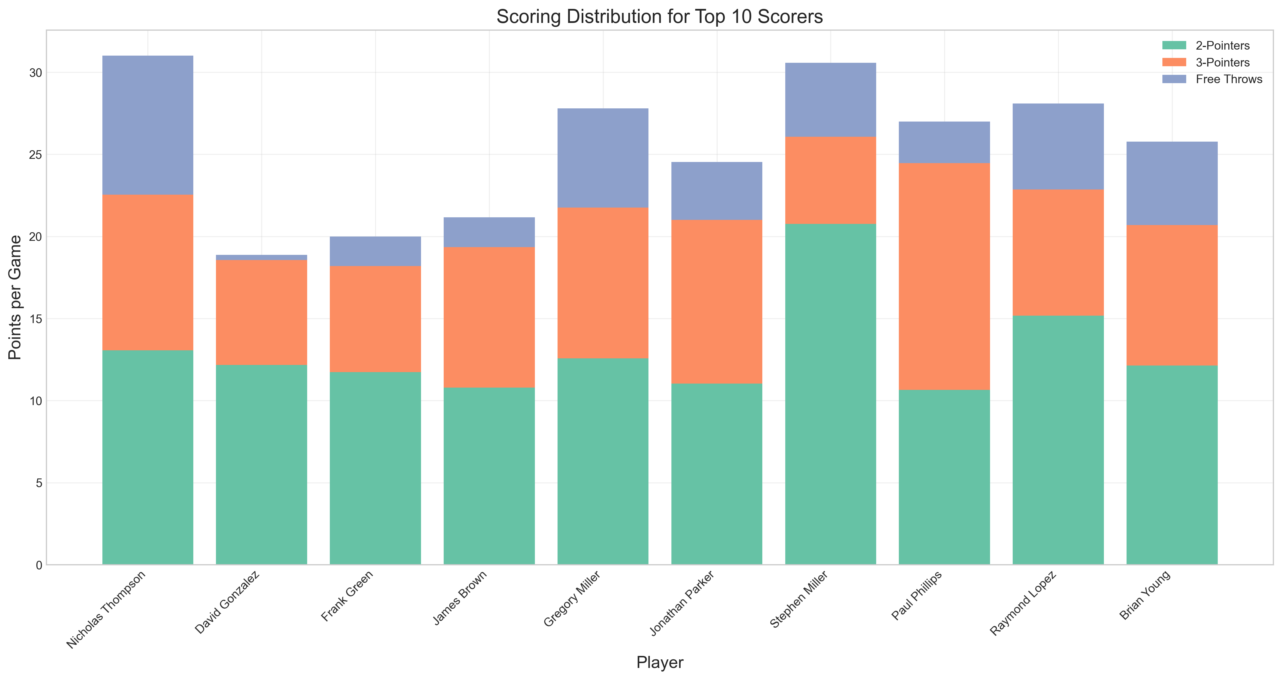
Scoring distribution analysis
Step 4: Performance correlation analysis
Want to understand relationships between different performance metrics? Just ask:
"Show me the correlation between minutes per game, points per game, and player efficiency for all players"
PlotsALot delivers a correlation analysis that reveals important relationships between playing time and various performance metrics.
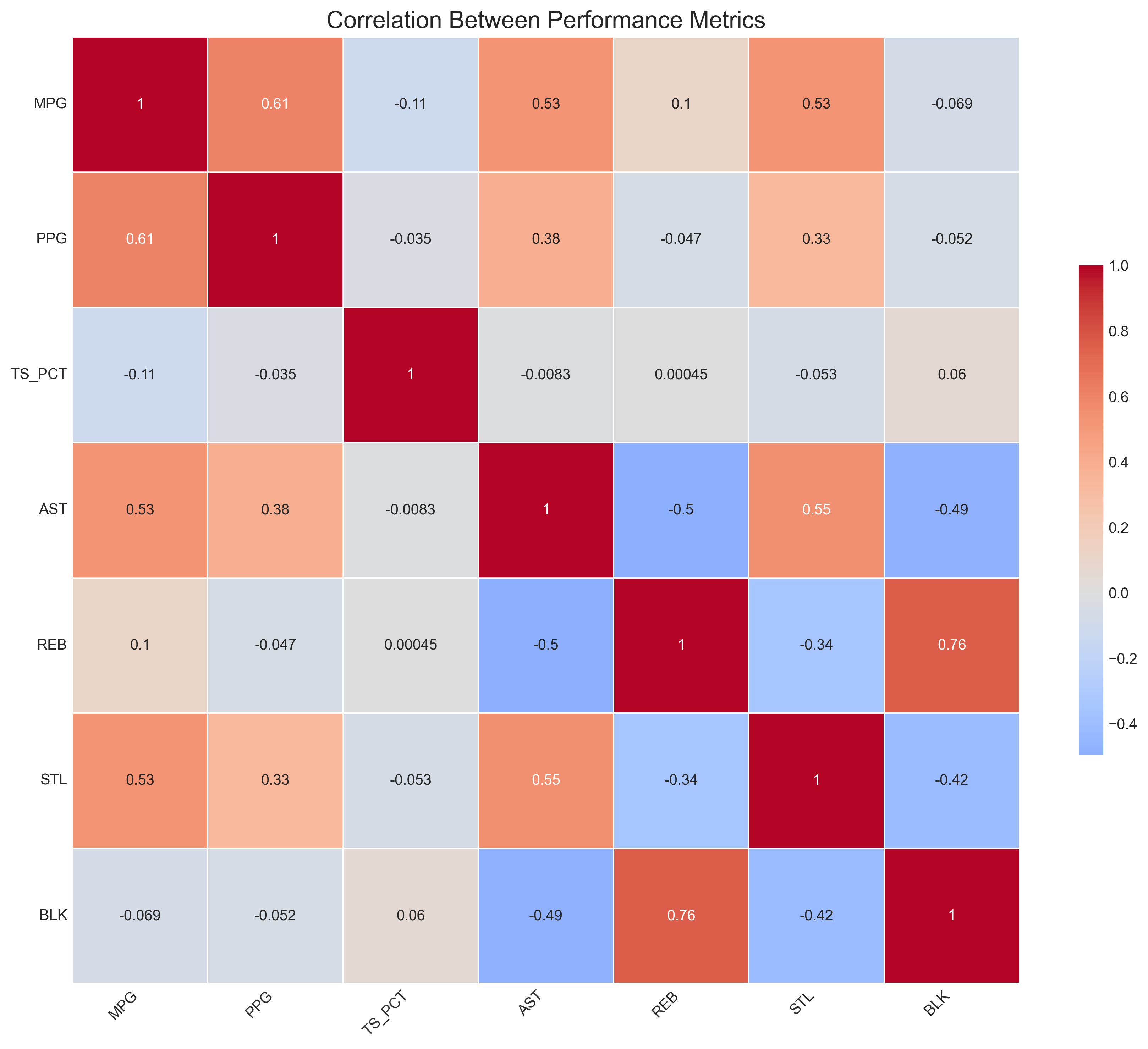
Performance correlation analysis
Step 5: Player comparison
Need to compare specific players across multiple metrics? Ask:
"Create a radar chart comparing LeBron James, Kevin Durant, Giannis Antetokounmpo, and Nikola Jokić across points, rebounds, assists, steals, and blocks per game"
PlotsALot generates a radar chart that makes it easy to visually compare the all-around games of different players.

Player comparison radar chart
Conclusion
PlotsALot transforms sports analytics from a specialized technical discipline into a conversation anyone can have with their data. Upload your sports statistics and start asking questions immediately - no programming required.
Whether you're a team analyst, fantasy sports player, bettor, or just a curious fan, PlotsALot helps you uncover insights that would otherwise require a data science team.
See Your Data in Action
Ready to visualize your own data? Try our AI-powered analysis tool and transform your data into beautiful insights.